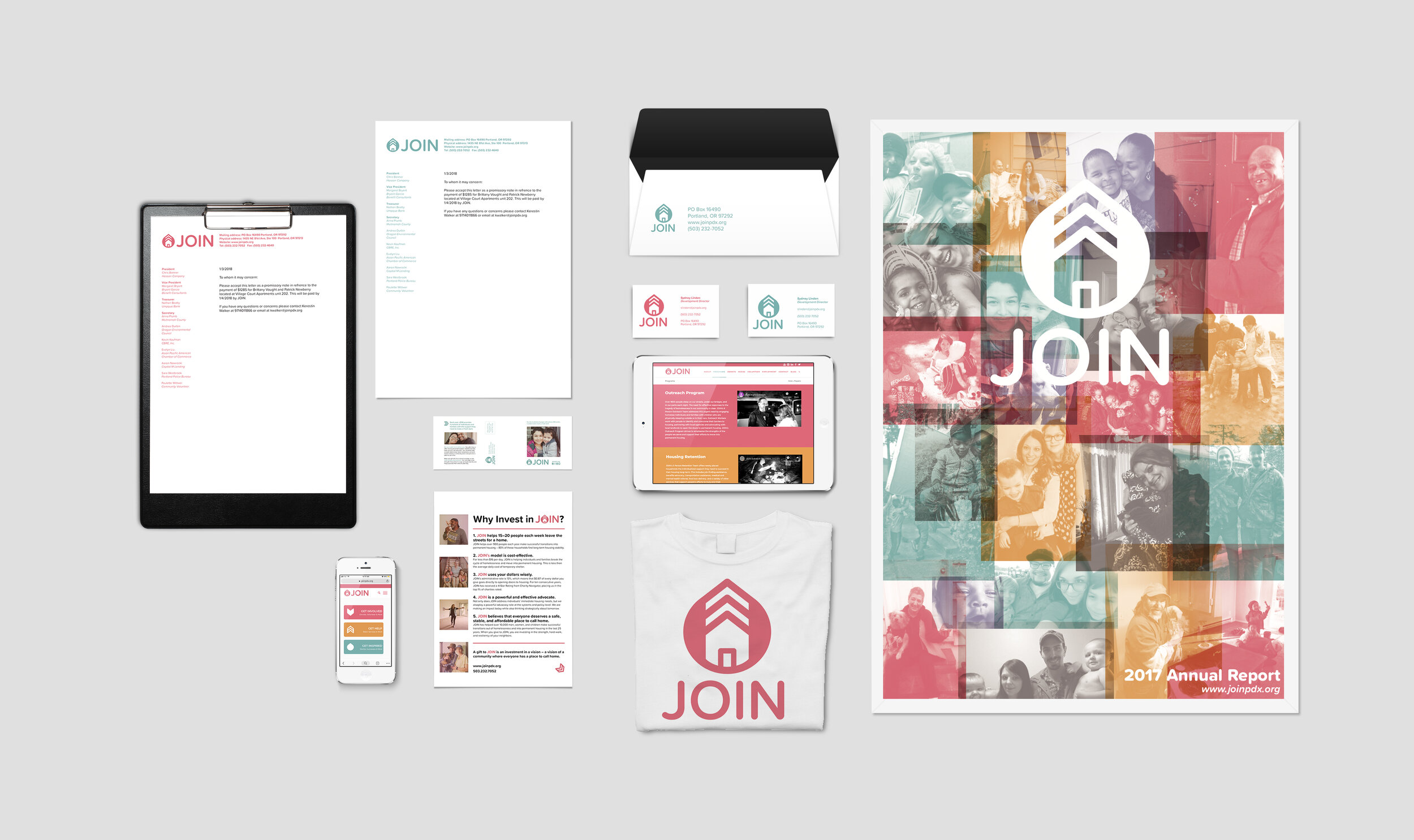
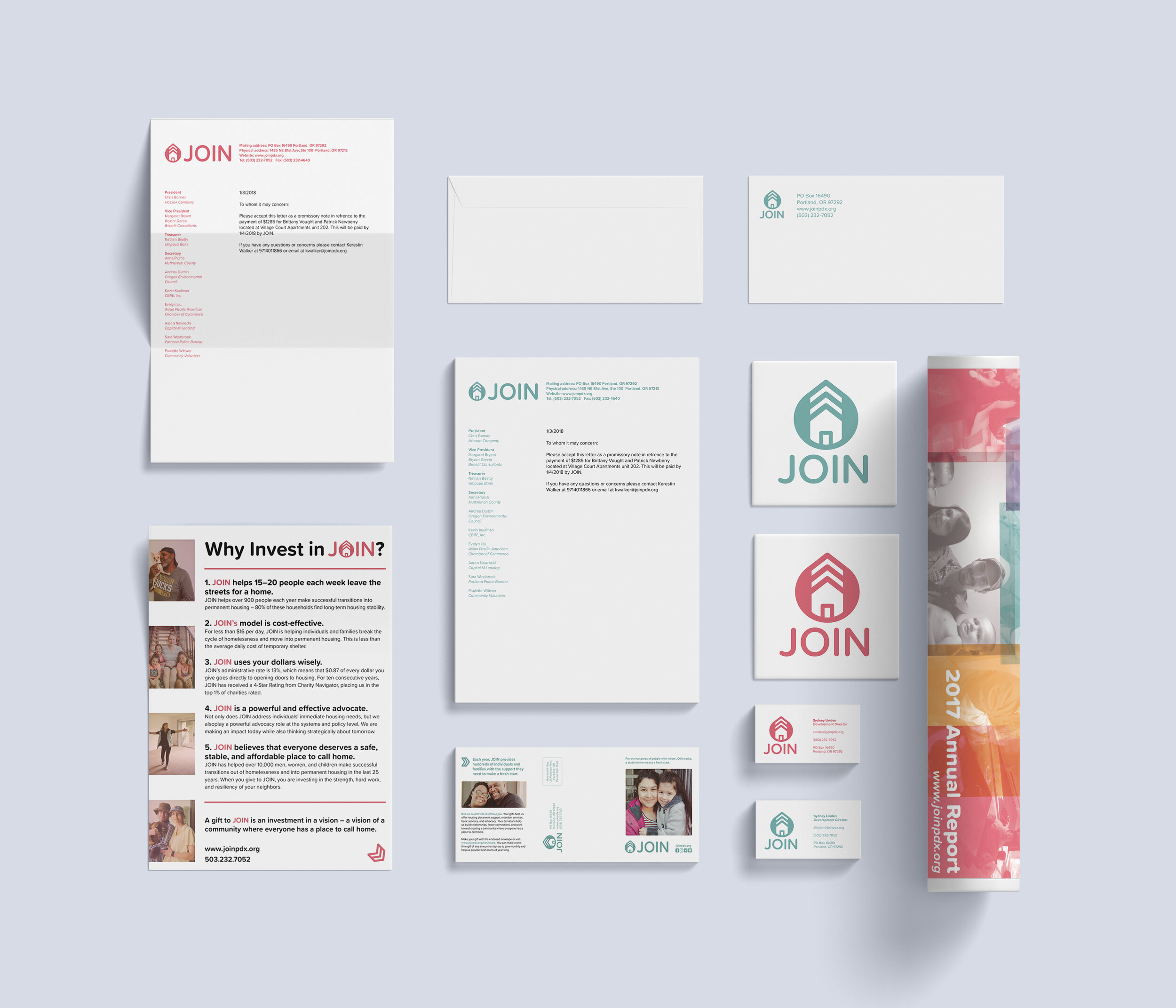
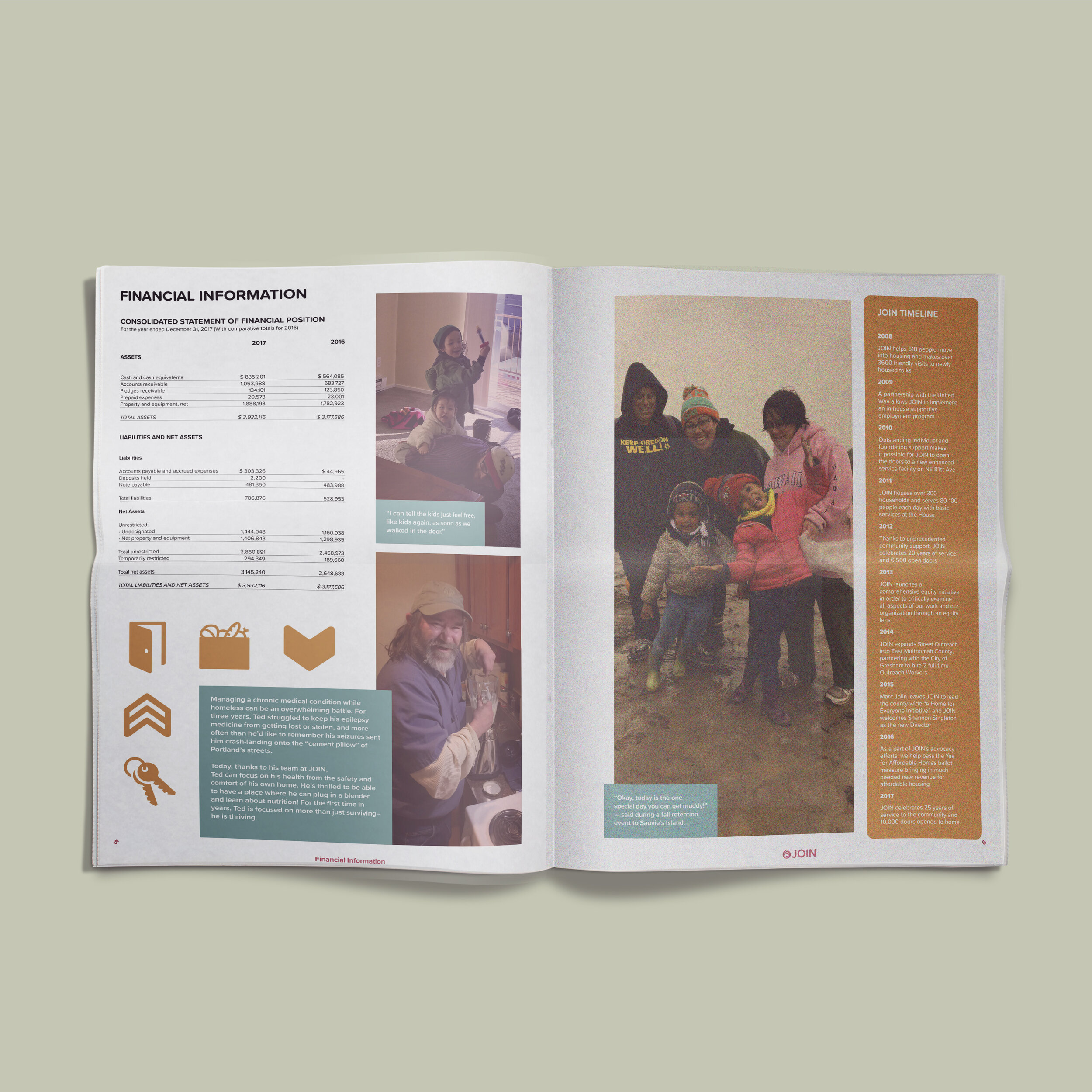
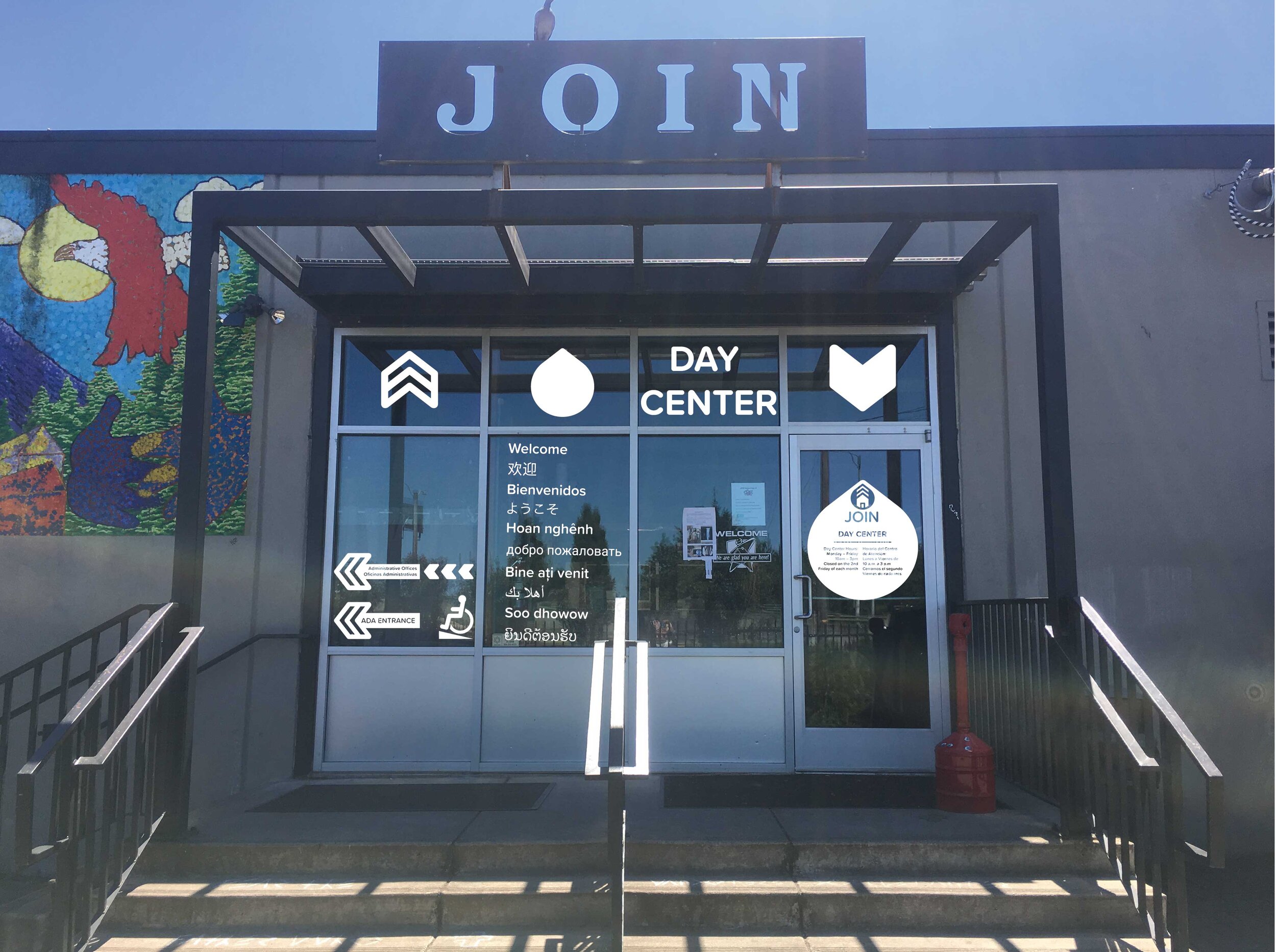
JOIN is a non-profit here in Portland that focuses on housing the houseless. In 2017, they started looking for junior designers who would be able to help them rebrand themselves. Myself, along with Leland Vaughan and Robby Day, were hired by JOIN to design an entire branded suite of deliverables. Among the deliverables, JOIN needed a new flexible logo, stationary, mailers, wayfinding at their physical space, a new website, social media assets, and a branded annual report. Leland, Robby, and I worked closely with the stakeholders at JOIN, over many rounds of meetings and iterations, to create a fresh, bright, and modern new visual identity for them.
Data Visualization for the JOIN annual report




Mathias Kemeny Endowed
Design Lecture Series
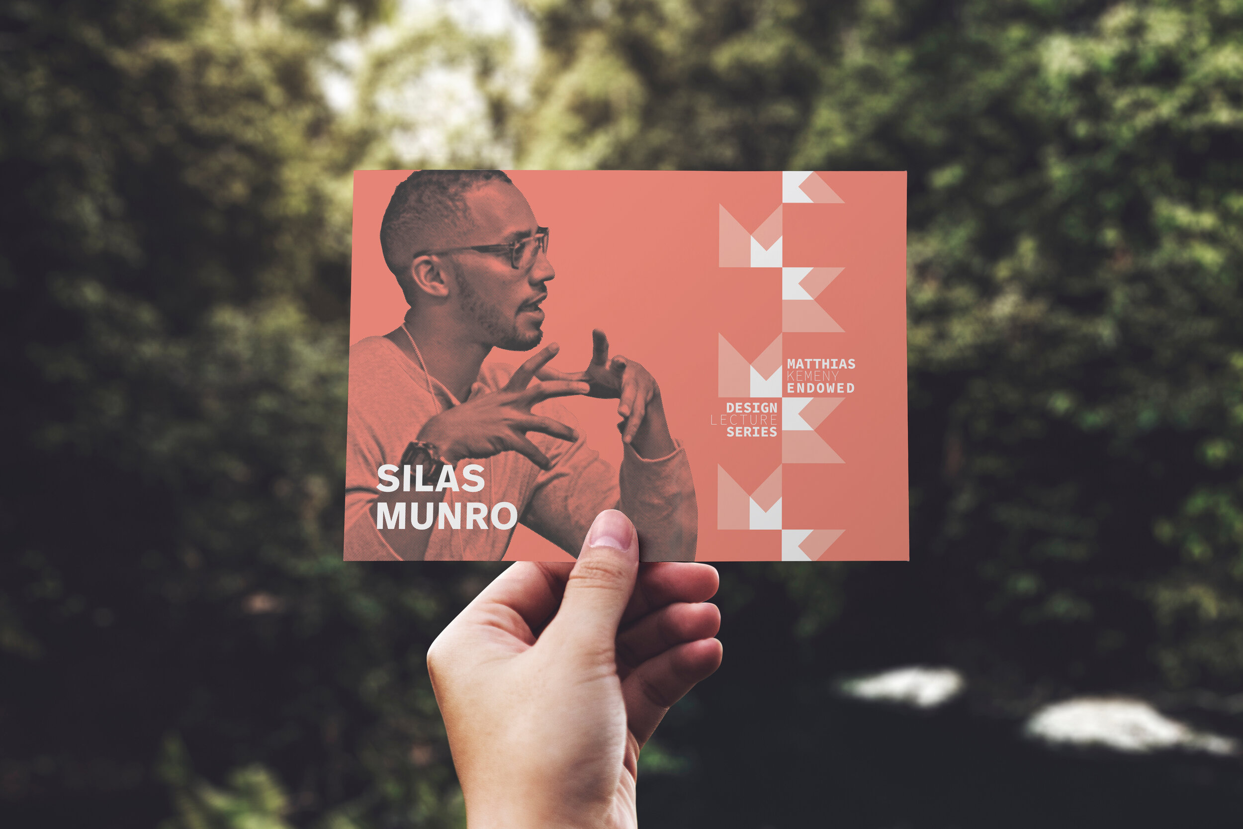
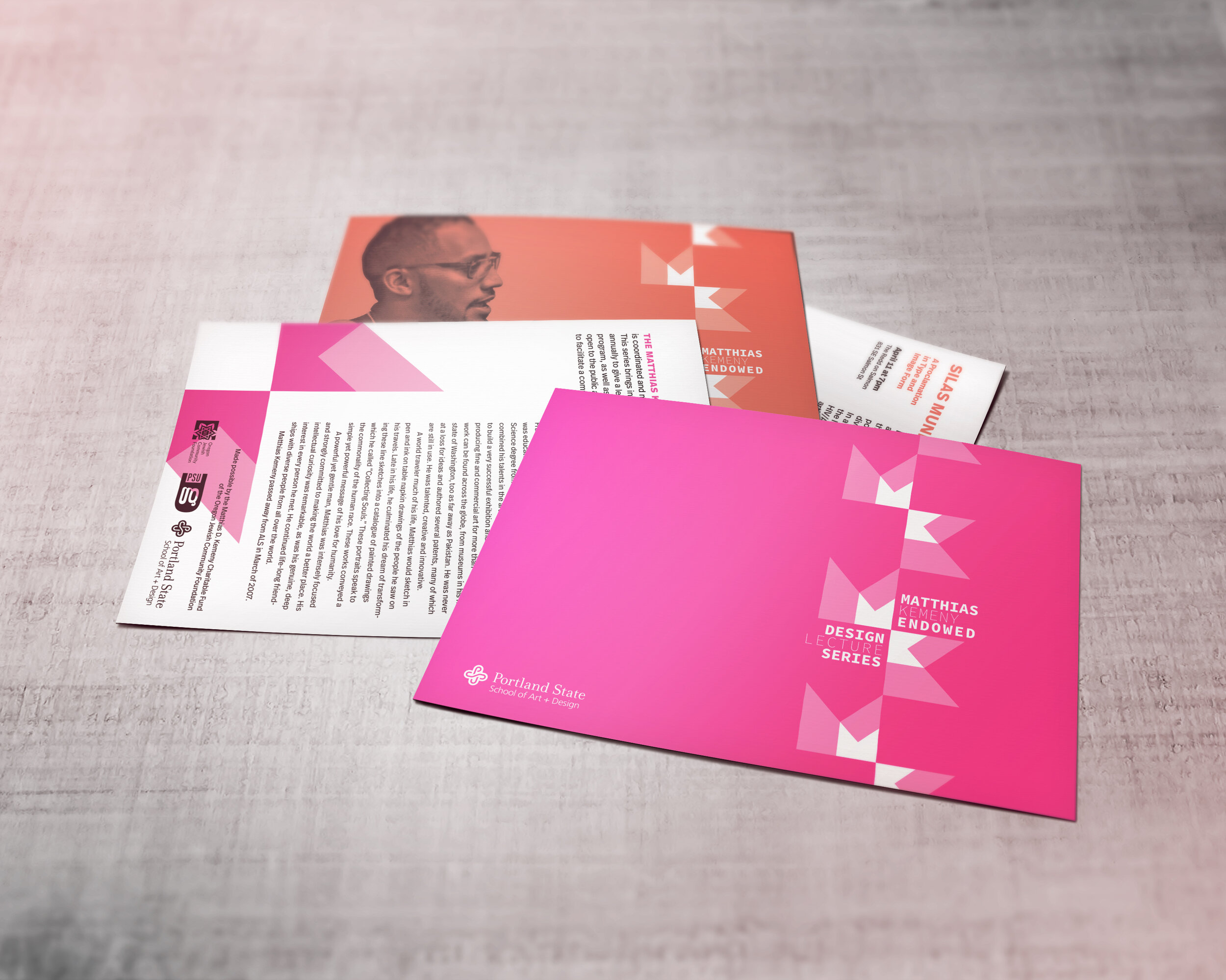
The Mathias Kemeny Endowed Design Lecture Series is an on-going lecture series in Portland that’s open to the public. This was a complicated project with hard to please stakeholders who wanted a logo that encompassed the entire title of the series. They needed something that could be added to assets, promotions, and internal materials. While each lecture in the series has a unique set of visuals for its promotional materials, and each is created by a different designer, the overall lecture series needed to have a unifying mark that identified the talk as a Kemeny Lecture. The examples below showcase the work I did to give the lecture series a cohesive and branded visual design.
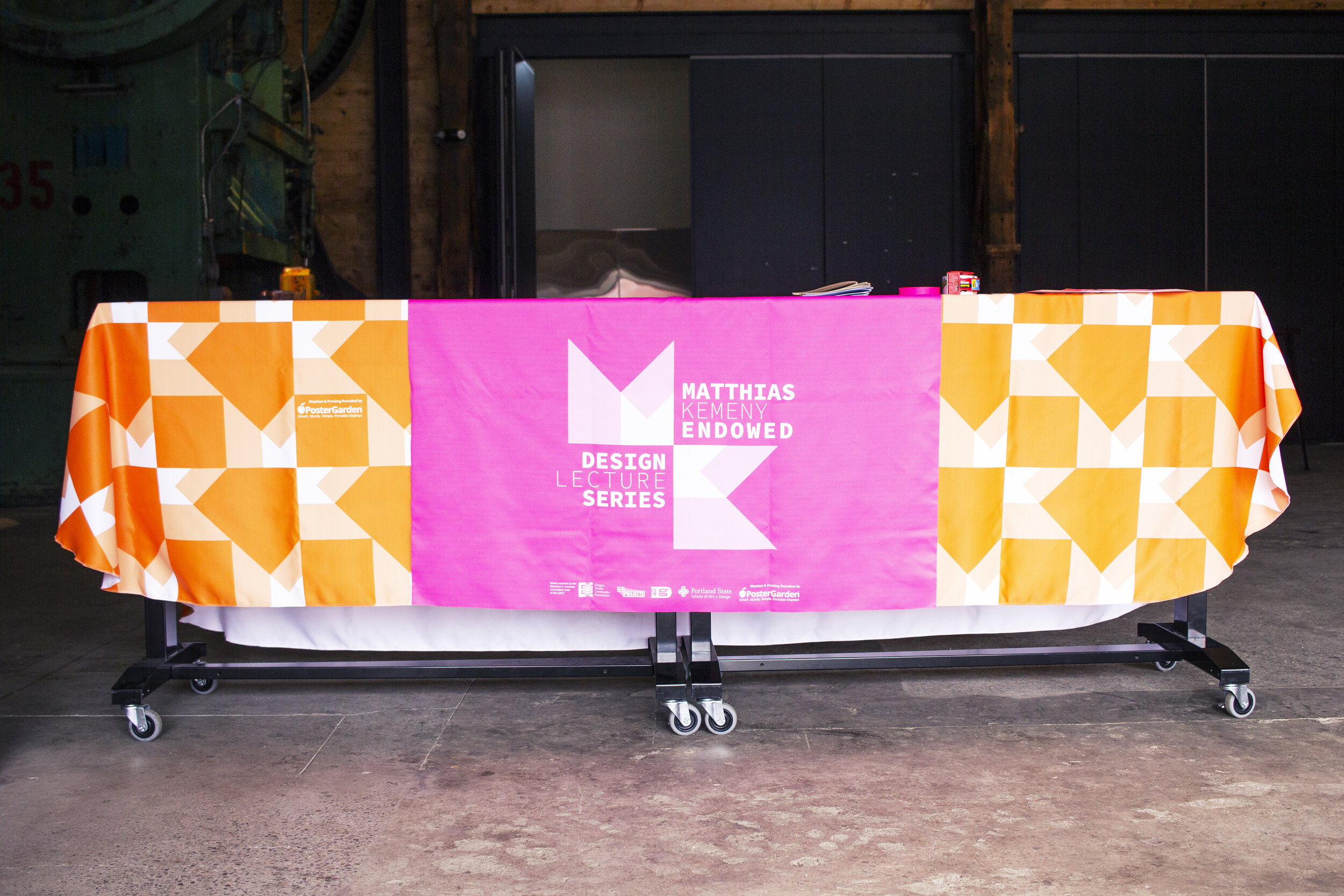


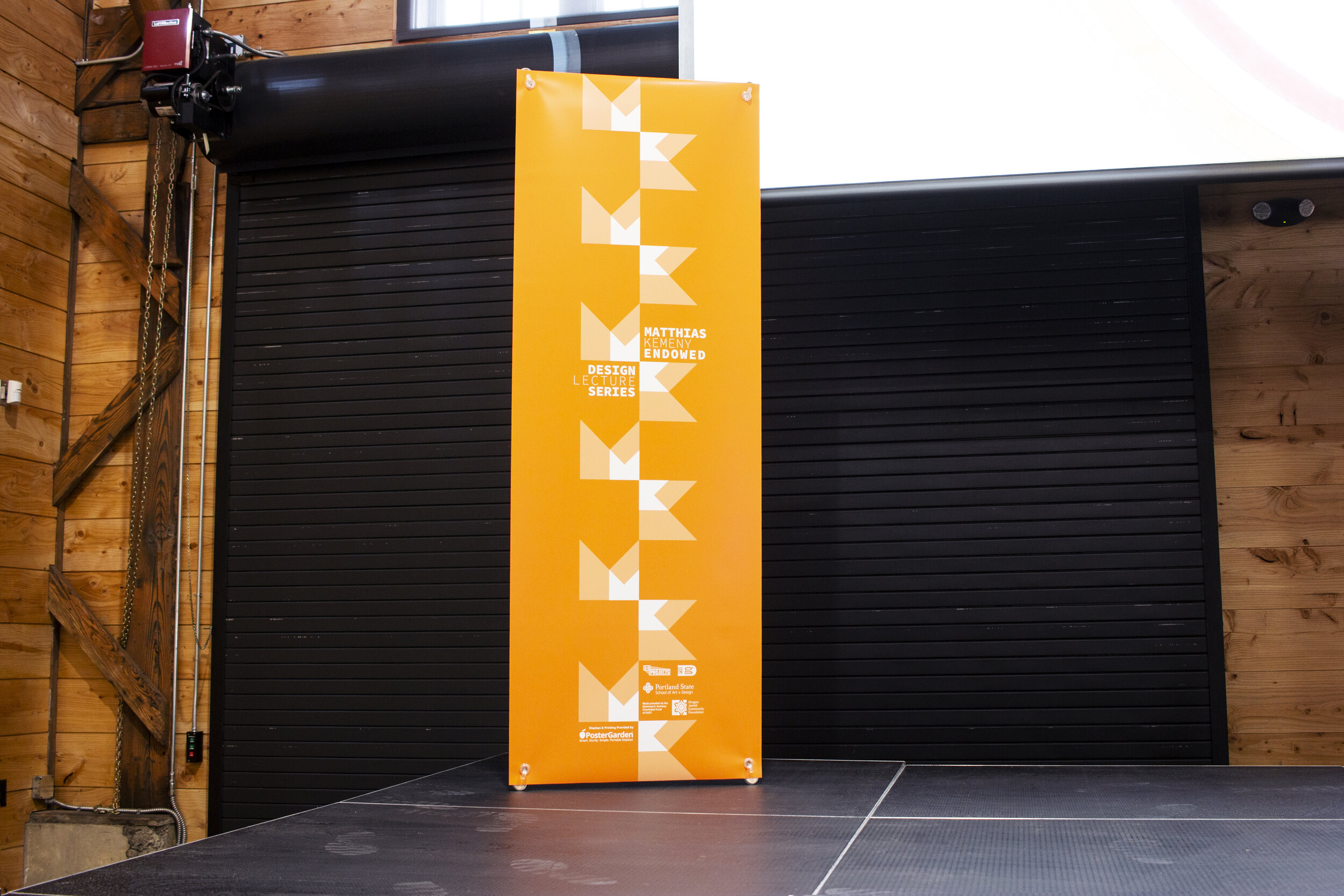
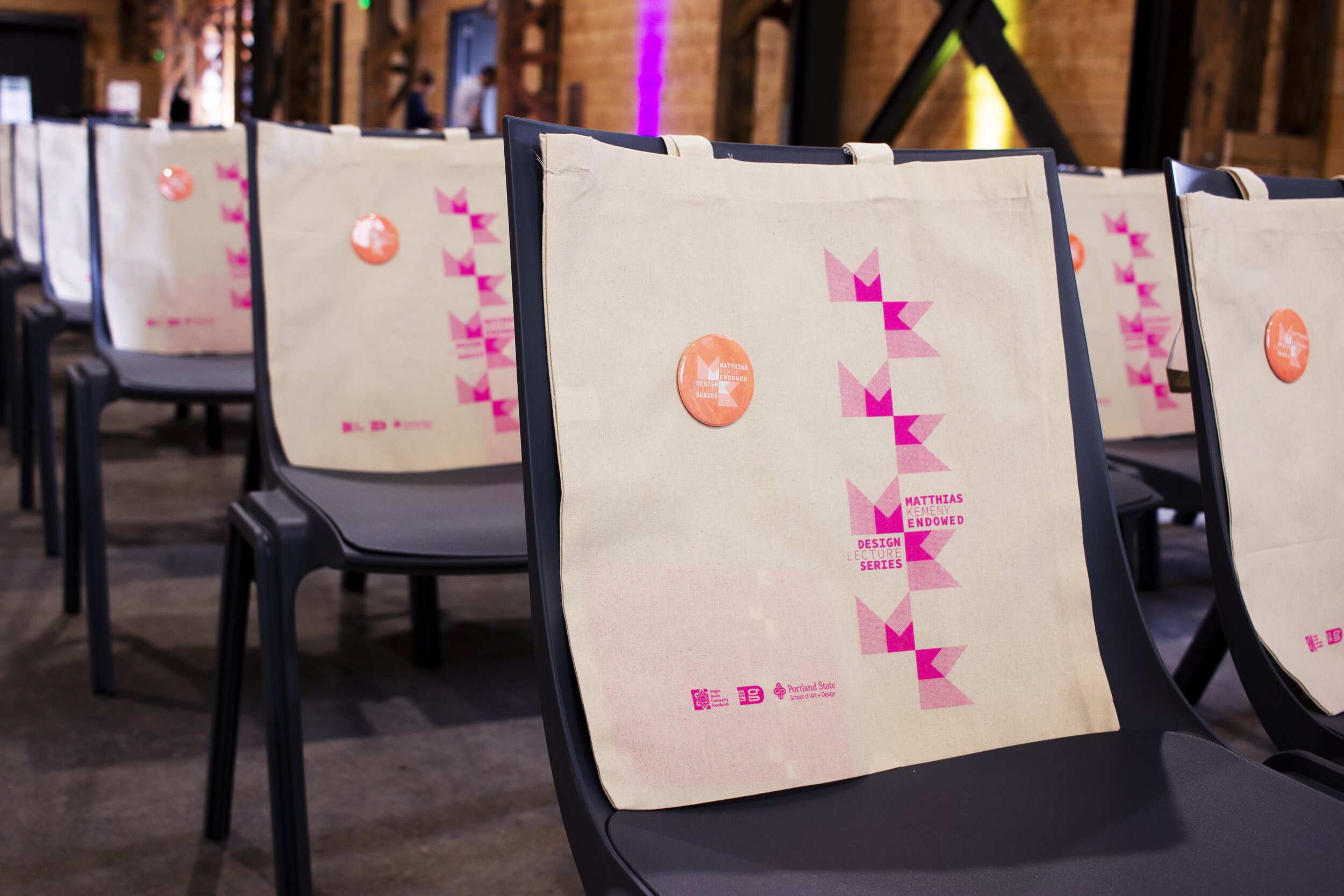
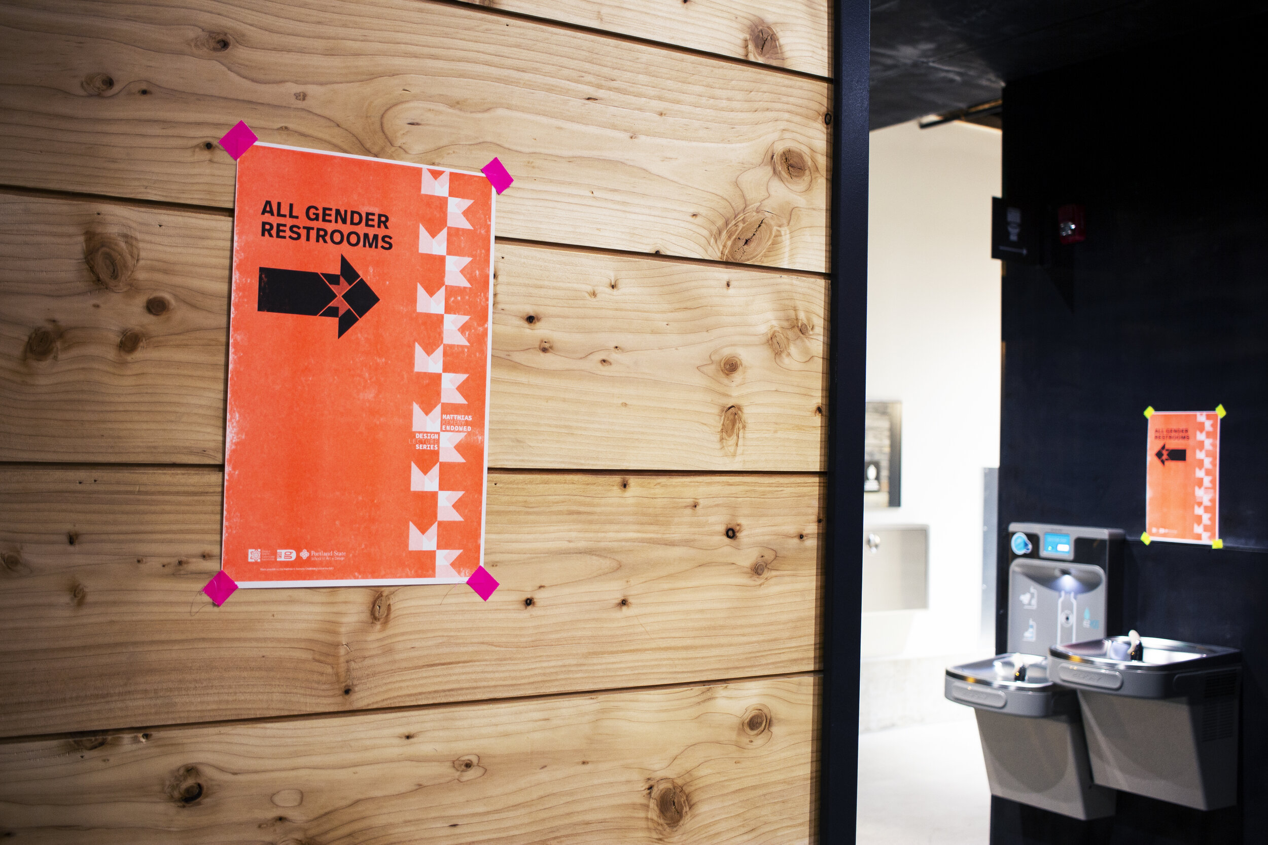
Gallery Show Identities
Triple
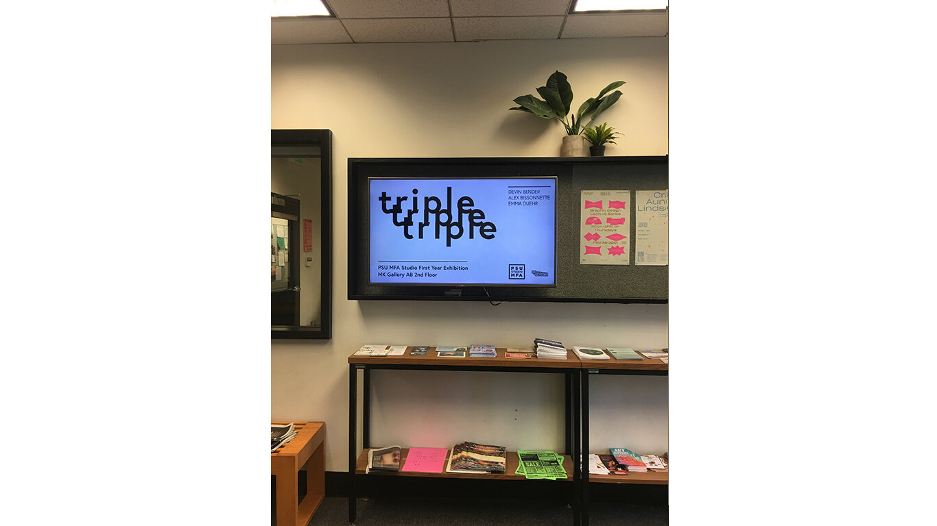
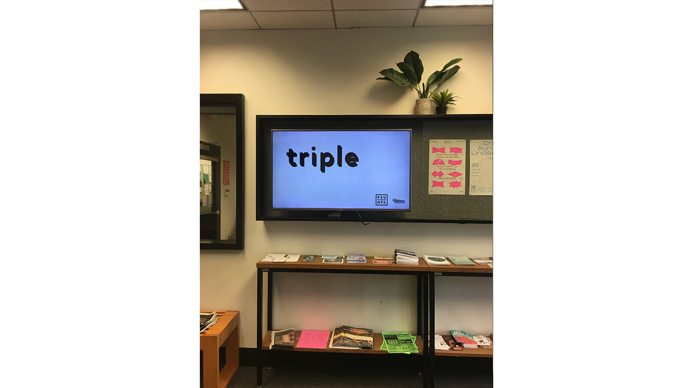
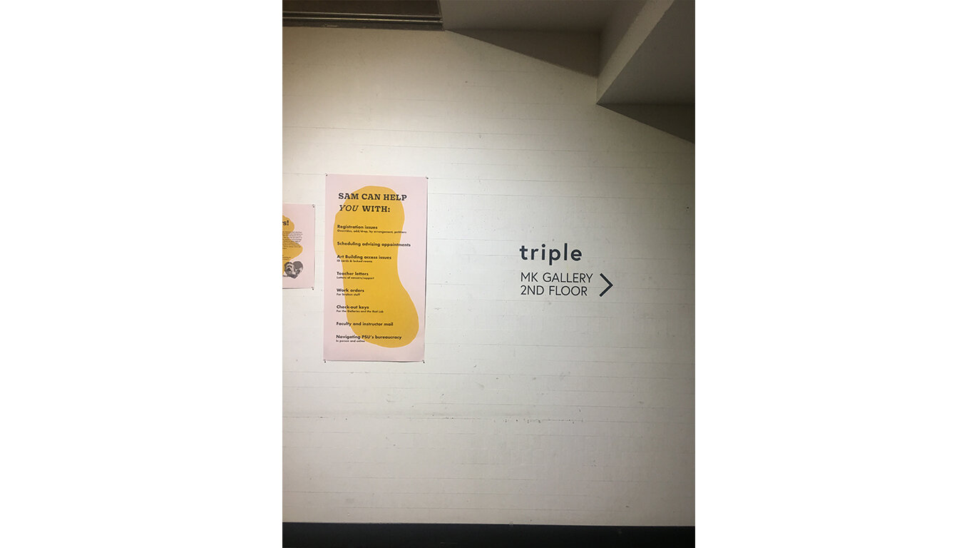
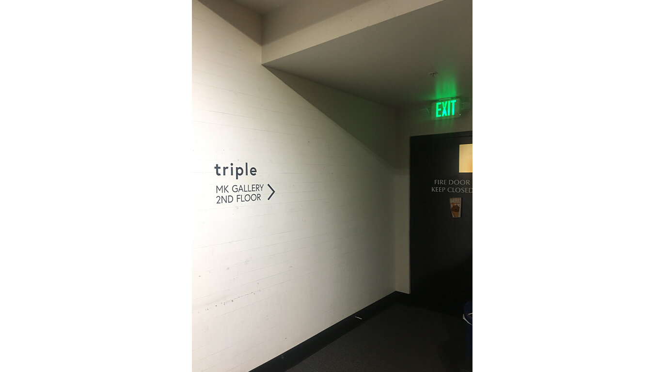
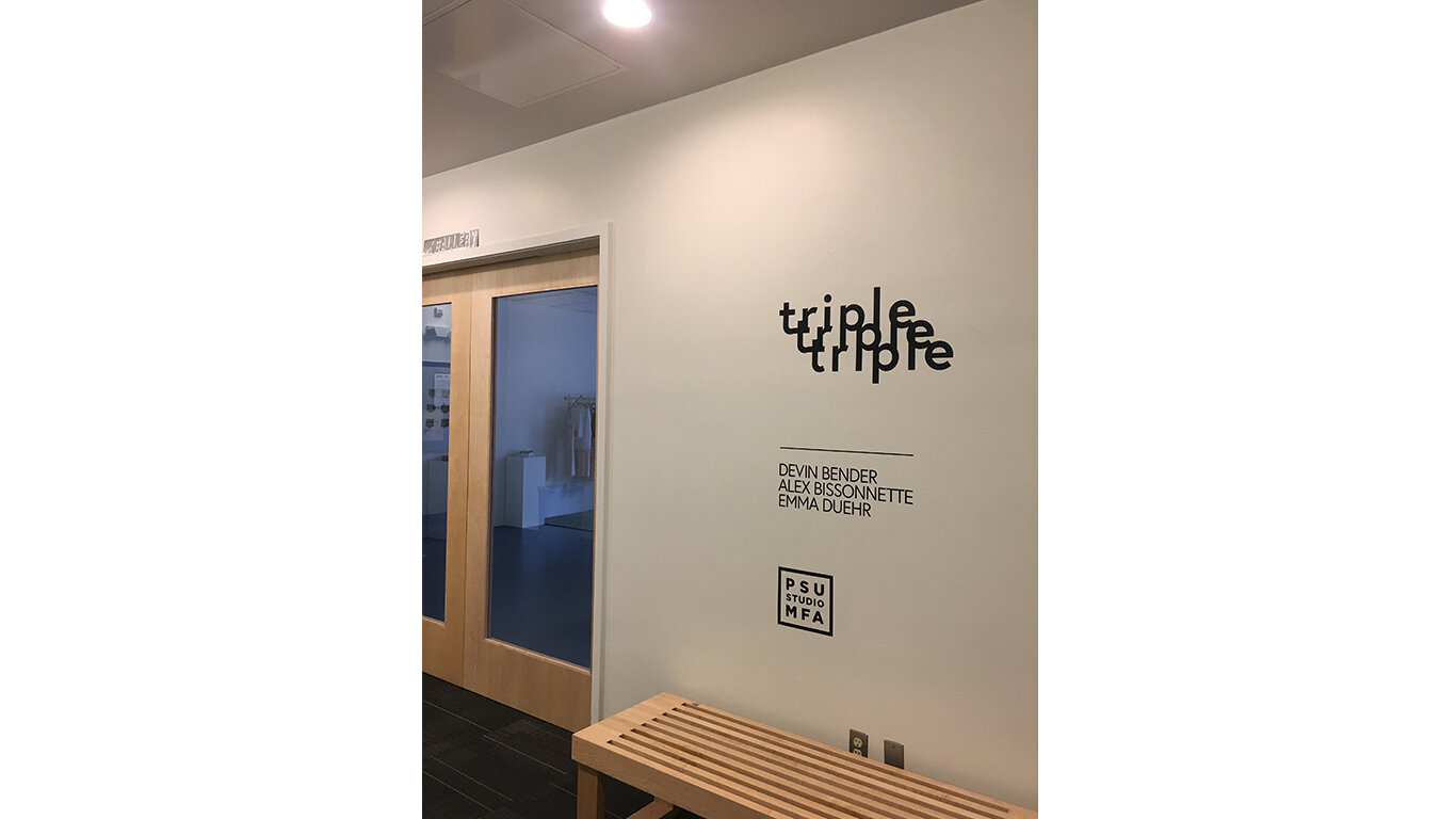
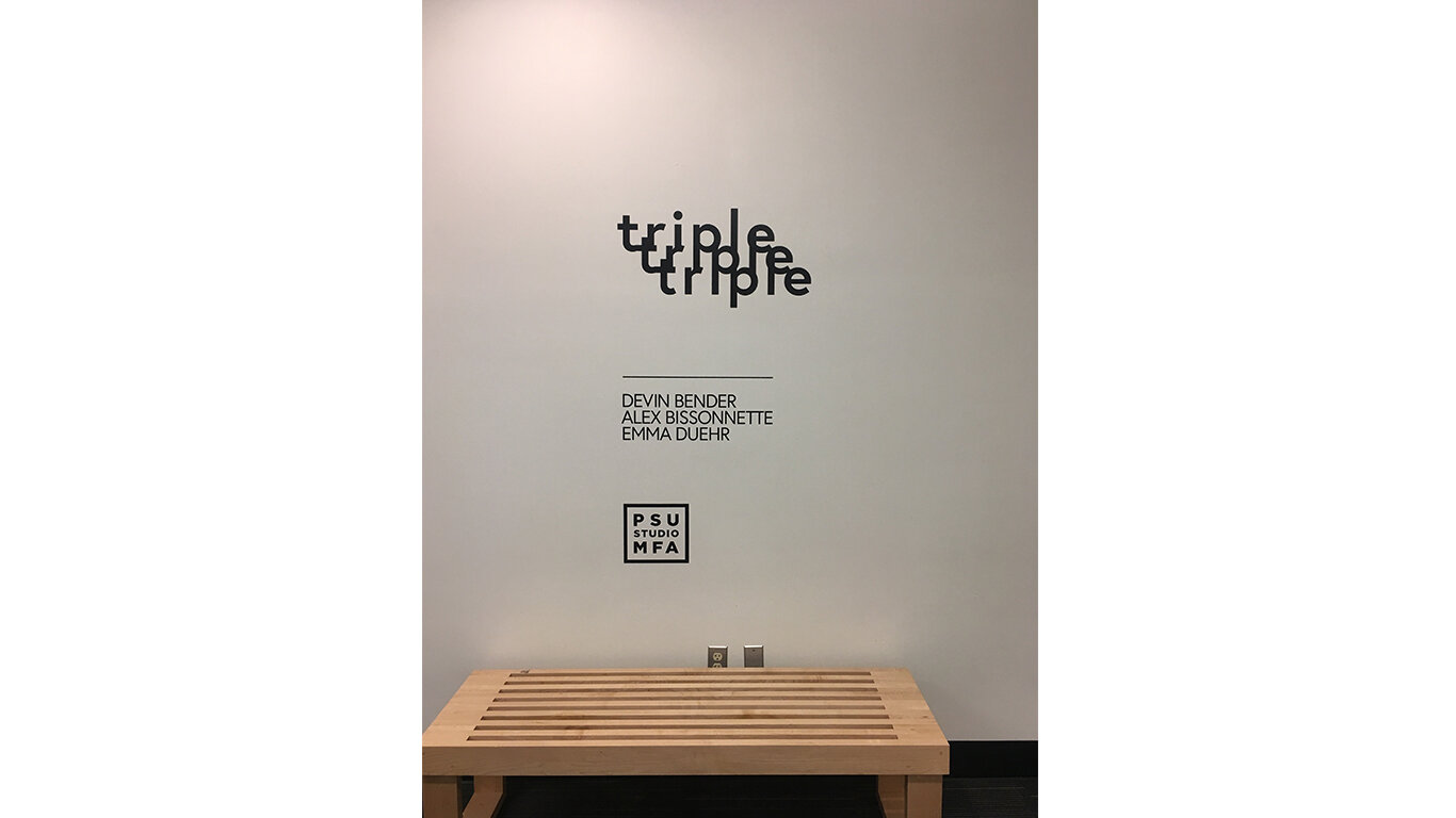
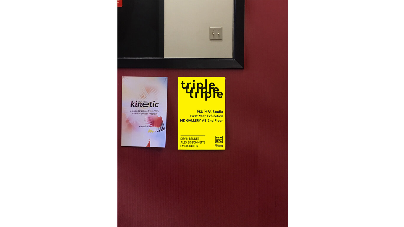
I worked with the MFA studio at Portland State University to craft an identity for their first year exhibition titled ‘Triple’. I created an eye-catching poster that was printed and distributed throughout the school, as well as two vinyl wall treatments and a motion graphic for the TV in the lobby of the art building used to draw in the students and the public to the show. All designed in a way that was engaging without upstaging the Art. This was a quick turnaround project in which the client approached me with the project on a Friday and needed it done by the following Monday. In three days, I designed the system, produced the files, and sent them all off all the files to the vinyl printers and the poster printers. By Monday, all the prints had been delivered and the show was installed, and the show opened on Tuesday. This project is a quintessential example of my ability to work quickly and efficiently under a tight deadline, all while producing high-quality work.
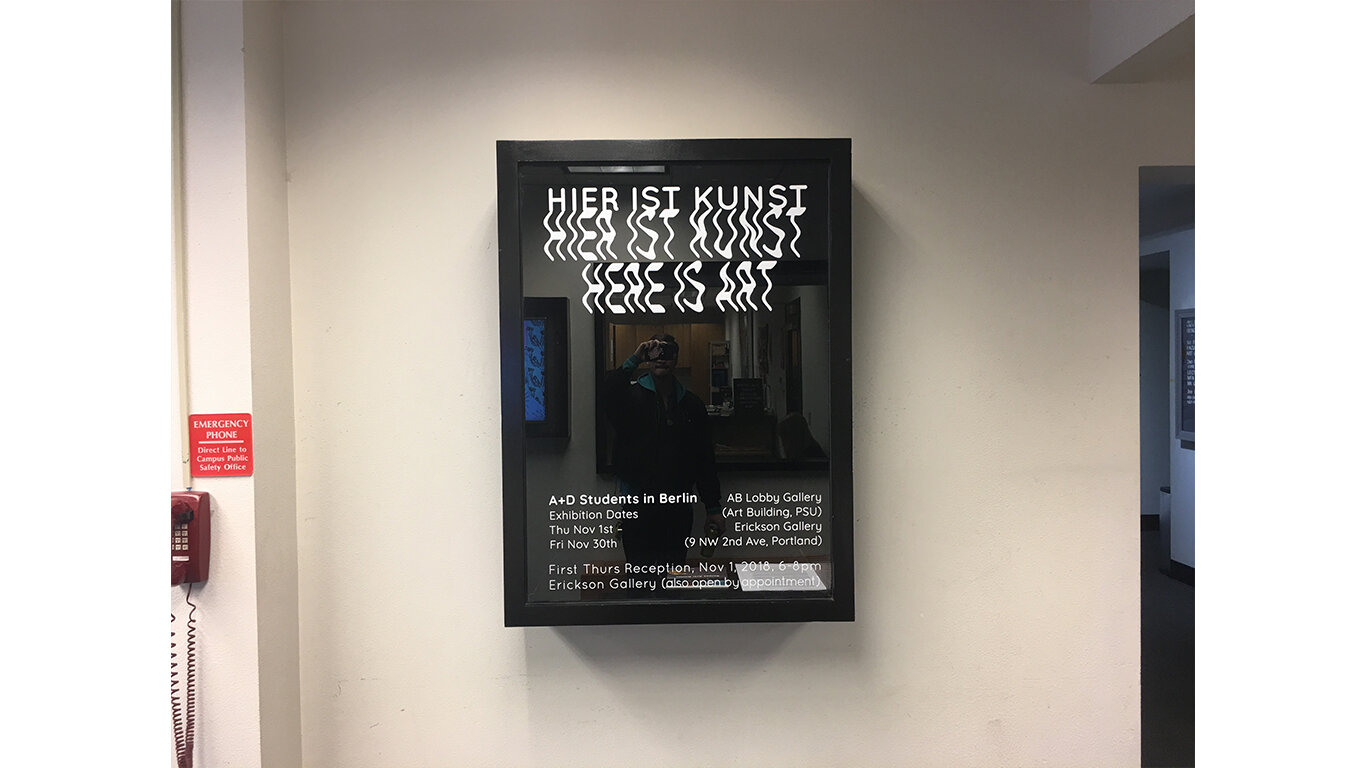
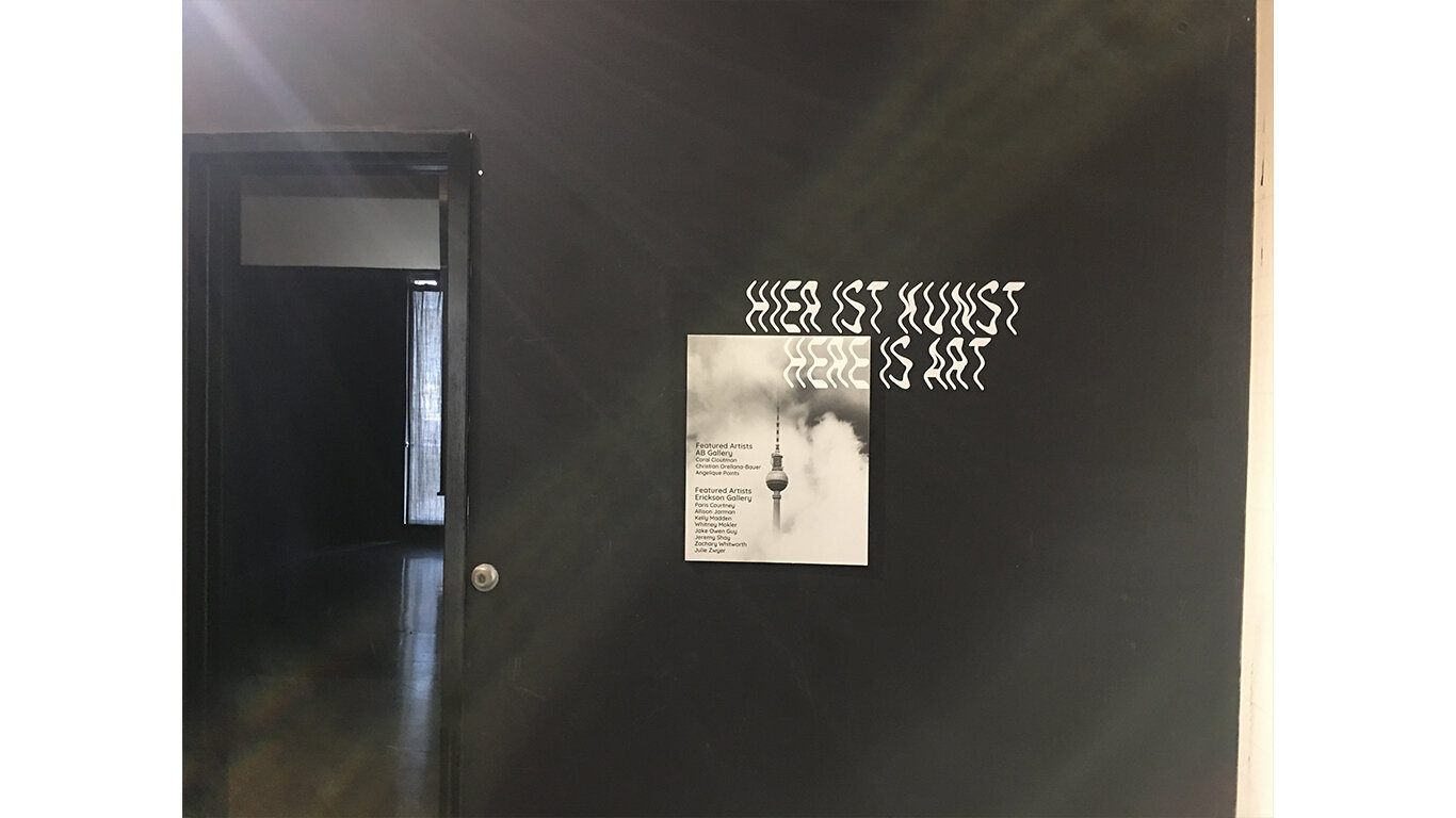
Hier ist Kunst: Here is Art
The artists that participate in Portland State’s study abroad program in Berlin each come back with a new body of work. Heir ist Kunst: Here is Art is a showcase of these collections. The instructor came to me looking for a designer to create visually connected design elements – a poster campaign, digital assets for TV and social media, and a vinyl treatment for the gallery space itself. We talked about the experience the students had, the realizations they came to, and the mood of the art they created. I designed quiet, ethereal visuals that both reflected the mood of the show while also playing with the structured nature of modernist German design.

